資料視覺化(Data Visualization) - Python 套件 - 互動式繪圖 - 散點圖、子圖實作、多圖堆疊應用 - Plotly筆記(二)
Github連結

1. 散點圖
plotly.graph_objs.Scatter()裡面的參數介紹
用於繪製數據點(散點)
symbol: markers的圖形,可以傳入一些整數(int),變換不同圖形或圖形角度,也可以傳入像是'star'來直接改變圖形
舉例
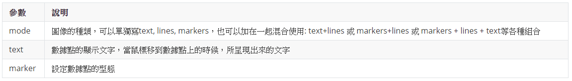
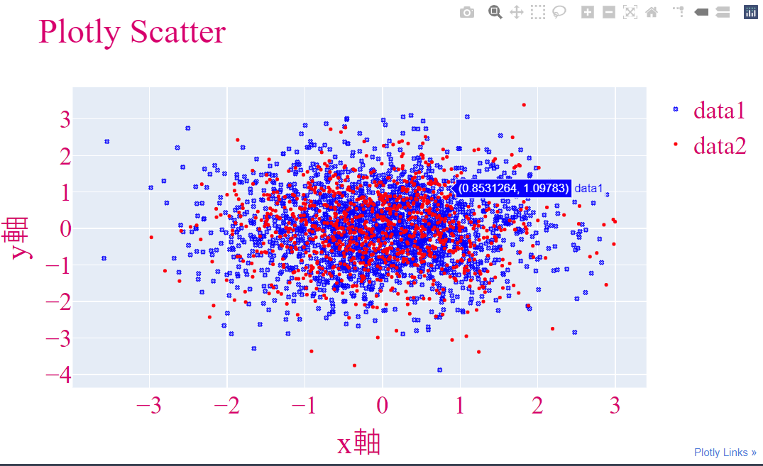
a. 點(marker)
import plotly.graph_objs as go
import plotly.offline as pof
import numpy as np
## 設定為離線
pof.init_notebook_mode(connected = True)
## data 1
## 隨機產生2000個二維數據
x = np.random.randn(2000)
y = np.random.randn(2000)
data1 = go.Scatter(
x = x,
y = y,
marker = {'color': 'blue', 'symbol': 104, 'size': 4},
mode = 'markers',
name = 'data1'
)
## data2
## 隨機產生1000個二維數據
x1 = np.random.randn(1000)
y1 = np.random.randn(1000)
data2 = go.Scatter(
x = x1,
y = y1,
marker = {'color': 'red', 'size': 4},
mode = 'markers',
name = 'data2'
)
## 將data1和data2裝進串列
data = [data1, data2]
## 介面設定
layout = go.Layout(
title = "Plotly Scatter",
xaxis = {'title': 'x軸'},
yaxis = {'title': 'y軸'},
font = {
'size': 28,
'family': 'serif',
'color': '#D9006C'
})
## 結合數據與介面
figure = go.Figure(data = data, layout = layout)
## 繪圖
pof.iplot(figure, filename = 'Plotly-Scatter', show_link = True, link_text = "Plotly Links", image_height = 800, image_width = 900)
執行結果
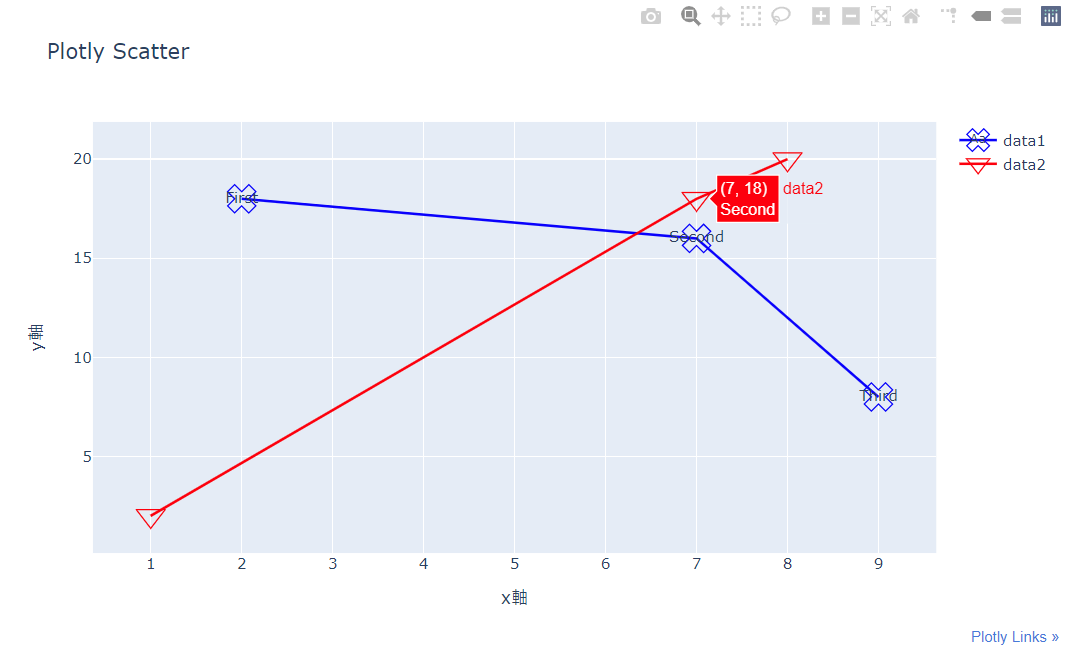
b.點(marker)+線(lines)+文字(text)
import plotly.graph_objs as go
import plotly.offline as pof
pof.init_notebook_mode(connected = True)
## 數據
## go.Scatter()
## marker: 記號點, symbol - 調整樣式
## mode: 圖像的種類,可以單獨寫text, lines, markers,也可以加在一起混合使用: text+lines 或 markers+lines 或 markers + lines + text等各種組合
## text: 標記上的文字
## name: 數據名稱
data1 = go.Scatter(
x = [2, 7, 9],
y = [18, 16, 8],
marker = {'color': 'blue', 'symbol': 104, 'size': 20},
mode = "markers+lines+text",
text = ["First", "Second", "Third"],
name = 'data1'
)
data2 = go.Scatter(
x = [1, 7, 8],
y = [2, 18, 20],
marker = {'color': 'red', 'symbol': 106, 'size': 20},
mode = "markers+lines",
text = ["First", "Second", "Third"],
name = 'data2'
)
## 介面
layout = go.Layout(title = "Plotly Scatter", xaxis = {'title': 'x軸'}, yaxis = {'title': 'y軸'})
## 將data和介面結合
figure = go.Figure(data = [data1, data2], layout = layout)
## 繪圖
pof.iplot(figure, filename = 'First Plotly', show_link = True, link_text = "Plotly Links", image = 'png', image_height = 800, image_width = 900)
執行結果
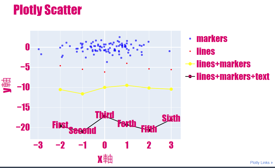
c. 綜合圖
import plotly.graph_objs as go
import plotly.offline as pof
import numpy as np
## 設定為離線
pof.init_notebook_mode(connected = True)
## data 1
## 隨機產生100個二維數據
x = np.random.randn(100)
y = np.random.randn(100)
data1 = go.Scatter(
x = x,
y = y,
marker = {'color': 'blue', 'symbol': 104, 'size': 4},
mode = 'markers',
name = 'markers'
)
## data2
x1 = [v for v in range(-2, 4)]
y1 = np.random.randn(10) - 5
data2 = go.Scatter(
x = x1,
y = y1,
marker = {'color': 'red', 'size': 4},
mode = 'markers',
name = 'lines'
)
## data3
x2 = [v for v in range(-2, 4)]
y2 = np.random.randn(10) - 10
data3 = go.Scatter(
x = x2,
y = y2,
marker = {'color': 'yellow', 'size': 10},
mode = 'lines+markers',
name = 'lines+markers'
)
## data4
x3 = [v for v in range(-2, 4)]
y3 = np.random.randn(10) - 20
data4 = go.Scatter(
x = x3,
y = y3,
marker = {'color': 'black', 'size': 10},
mode = 'lines+markers+text',
text = ["First", "Second", "Third", "Forth", "Fifth", "Sixth"],
name = 'lines+markers+text'
)
## 將data1和data2裝進串列
data = [data1, data2, data3, data4]
## 介面設定
layout = go.Layout(
title = "Plotly Scatter",
xaxis = {'title': 'x軸'},
yaxis = {'title': 'y軸'},
font = {
'size': 28,
'family': 'fantasy',
'color': '#D9006C'
})
## 結合數據與介面
figure = go.Figure(data = data, layout = layout)
## 繪圖
pof.iplot(figure, filename = 'Plotly-Scatter', show_link = True, link_text = "Plotly Links", image_height = 800, image_width = 900)
執行結果
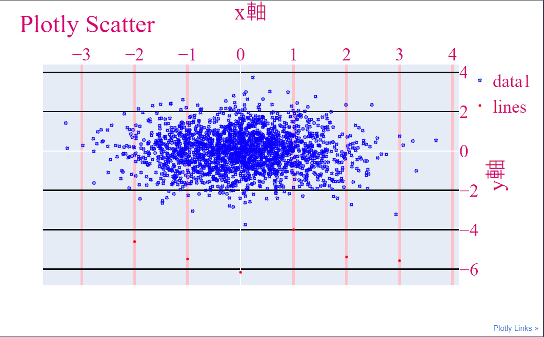
d. 設定tick來改變介面樣子
在前一篇我有提到許多Layout可以使用的參數,這邊我就拿幾個來實作給大家看,大家也可以根據這些參數來調整看看,可以產生許多不同的效果
import plotly.graph_objs as go
import plotly.offline as pof
import numpy as np
## 設定為離線
pof.init_notebook_mode(connected = True)
## data 1
## 隨機產生2000個二維數據
x = np.random.randn(2000)
y = np.random.randn(2000)
data1 = go.Scatter(
x = x,
y = y,
marker = {'color': 'blue', 'symbol': 104, 'size': 4},
mode = 'markers',
name = 'data1'
)
## 將data1裝進串列
data = [data1, data2]
## 介面設定
layout = go.Layout(
title = "Plotly Scatter",
xaxis = {'title': 'x軸', 'gridwidth': 4, 'showgrid': True, 'gridcolor': 'pink', 'side': 'top', 'tickcolor': "blue", 'zeroline': True},
yaxis = {'title': 'y軸', 'gridwidth': 2, 'showgrid': True, 'gridcolor': 'black', 'side': 'right'},
font = {
'size': 28,
'family': 'serif',
'color': '#D9006C'
})
## 結合數據與介面
figure = go.Figure(data = data, layout = layout)
## 繪圖
pof.iplot(figure, filename = 'Plotly-Scatter', show_link = True, link_text = "Plotly Links", image_height = 800, image_width = 900)
執行結果
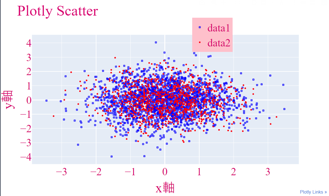
e. 設定legend來顯示數據資訊
import plotly.graph_objs as go
import plotly.offline as pof
import numpy as np
## 設定為離線
pof.init_notebook_mode(connected = True)
## data 1
## 隨機產生2000個二維數據
x = np.random.randn(2000)
y = np.random.randn(2000)
data1 = go.Scatter(
x = x,
y = y,
marker = {'color': 'blue', 'symbol': 104, 'size': 4},
mode = 'markers',
name = 'data1'
)
## data2
## 隨機產生1000個二維數據
x1 = np.random.randn(1000)
y1 = np.random.randn(1000)
data2 = go.Scatter(
x = x1,
y = y1,
marker = {'color': 'red', 'size': 4},
mode = 'markers',
name = 'data2'
)
## 將data1和data2裝進串列
data = [data1, data2]
## 介面設定
layout = go.Layout(
title = "Plotly Scatter",
xaxis = {'title': 'x軸'},
yaxis = {'title': 'y軸'},
font = {
'size': 28,
'family': 'serif',
'color': '#D9006C'
},
showlegend = True,
legend = {
'x': 0.6,
'yanchor': 'middle',
'bgcolor': 'pink',
'bordercolor': 'black'
} )
## 結合數據與介面
figure = go.Figure(data = data, layout = layout)
## 繪圖
pof.iplot(figure, filename = 'Plotly-Scatter', show_link = True, link_text = "Plotly Links", image_height = 800, image_width = 900)
執行結果
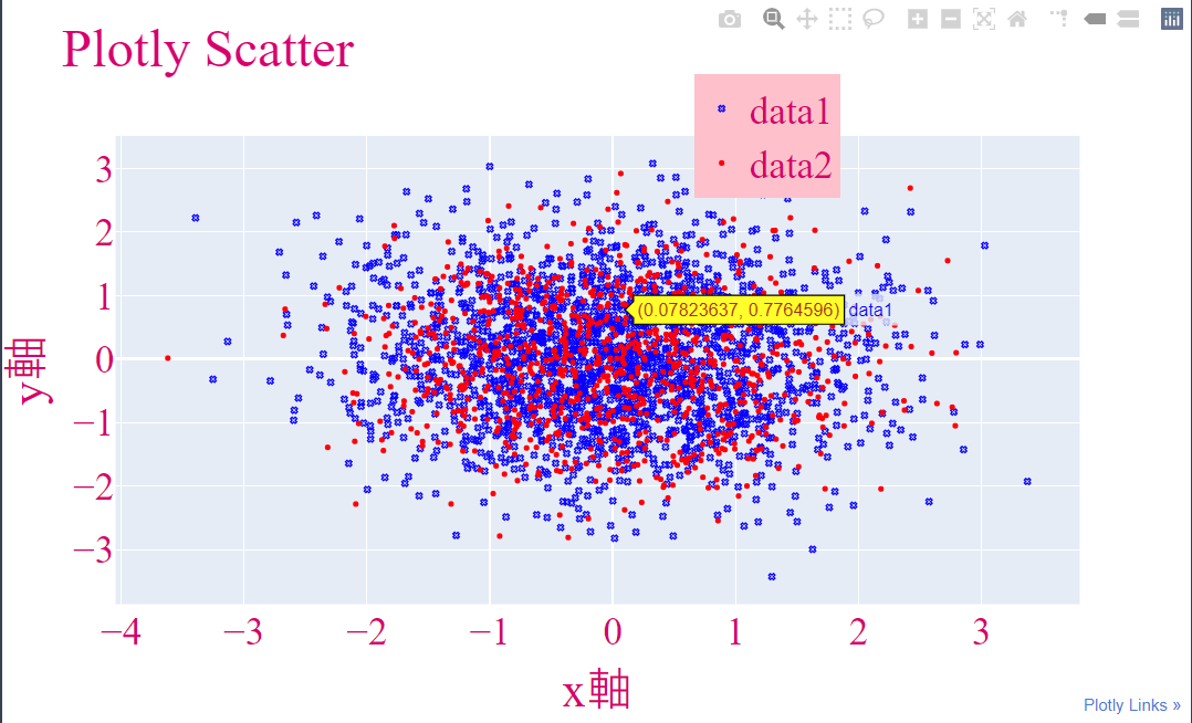
f. 設定hoverlabel,來控制鼠標移入數據的特效
我將鼠標移入後的字體變成咖啡色,背景變成黃色
import plotly.graph_objs as go
import plotly.offline as pof
import numpy as np
## 設定為離線
pof.init_notebook_mode(connected = True)
## data 1
## 隨機產生2000個二維數據
x = np.random.randn(2000)
y = np.random.randn(2000)
data1 = go.Scatter(
x = x,
y = y,
marker = {'color': 'blue', 'symbol': 104, 'size': 4},
mode = 'markers',
name = 'data1'
)
## data2
## 隨機產生1000個二維數據
x1 = np.random.randn(1000)
y1 = np.random.randn(1000)
data2 = go.Scatter(
x = x1,
y = y1,
marker = {'color': 'red', 'size': 4},
mode = 'markers',
name = 'data2'
)
## 將data1和data2裝進串列
data = [data1, data2]
## 介面設定
layout = go.Layout(
title = "Plotly Scatter",
xaxis = {'title': 'x軸'},
yaxis = {'title': 'y軸'},
font = {
'size': 28,
'family': 'serif',
'color': '#D9006C'
},
showlegend = True,
legend = {
'x': 0.6,
'yanchor': 'middle',
'bgcolor': 'pink',
'bordercolor': 'black'
} ,
hoverlabel = {
'bgcolor': 'yellow',
'bordercolor': 'black',
'namelength': -1,
'font': {'color': 'brown'}
}
)
## 結合數據與介面
figure = go.Figure(data = data, layout = layout)
## 繪圖
pof.iplot(figure, filename = 'Plotly-Scatter', show_link = True, link_text = "Plotly Links", image_height = 800, image_width = 900)
執行結果
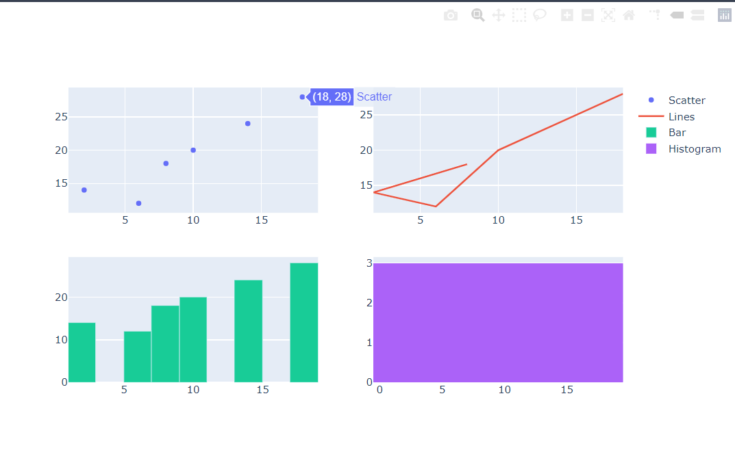
2. 子圖的應用
- 欲繪製子圖,我們需要導入plotly.subplots裡面的make_subplots套件
- 使用add_trace()來增加子圖數量
## 導入套件 import plotly.graph_objs as go from plotly.subplots import make_subplots ## 構建一個2X2的大圖 fig = make_subplots(rows = 2, cols = 2) ## 構建子圖 ## 子圖1 fig.add_trace( go.Scatter(x = [8, 2, 6, 10, 14, 18], y = [18, 14, 12, 20, 24, 28], mode = 'markers', name = 'Scatter'), row = 1, col = 1 ) ## 子圖2 fig.add_trace( go.Scatter(x = [8, 2, 6, 10, 14, 18], y = [18, 14, 12, 20, 24, 28], mode = 'lines', name = 'Lines'), row = 1, col = 2 ) ## 子圖3 fig.add_trace( go.Bar(x = [8, 2, 6, 10, 14, 18], y = [18, 14, 12, 20, 24, 28], name = 'Bar'), row = 2, col = 1 ) ## 子圖1 fig.add_trace( go.Histogram(x = [8, 2, 6, 10, 14, 18], y = [18, 14, 12, 20, 24, 28], name = 'Histogram'), row = 2, col = 2 ) ## 顯示圖片 fig.show()
執行結果
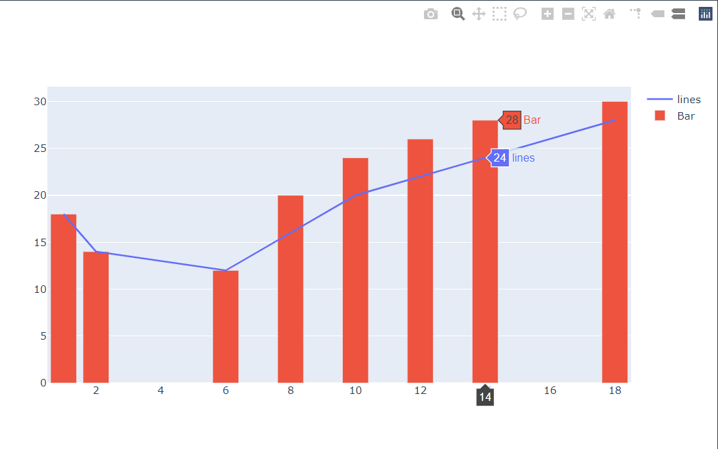
3. 多組圖繪製於一起
- 使用add_trace()這個函式功能可以將多組圖繪製在一起
- 舉例: 實現在同一張圖上擁有柱狀圖和折線圖
## 導入套件 import plotly.graph_objs as go ## 構建一個圖形板 fig = go.Figure() ## 加入各種類型的圖 ## 折線圖 fig.add_trace( go.Scatter(x = [1, 2, 6, 10, 14, 18], y = [18, 14, 12, 20, 24, 28], mode = 'lines', name = 'lines') ) ## 柱狀圖 fig.add_trace( go.Bar(x = [1, 2, 6, 8, 10, 12, 14, 18], y = [18, 14, 12, 20, 24, 26, 28, 30], name = 'Bar') ) ## 顯示圖片 fig.show()
執行結果
接下來我會開始使用Plotly來實作各種圖形喔,有興趣的大家可以在跟著我繼續學習
Reference
https://www.youtube.com/watch?v=ifYugIP0pPQ
htts://plotly.com/python/
https://www.cnblogs.com/feffery/p/9293745.html
https://blogs.csdn.net/u012897374/article/details/77857980
https://images.plot.ly/plotly-documentation/images/python_cheat_sheet.pdf